Visual aids have always been a cornerstone in the educational process. Among these, comparison charts stand out for their ability to simplify complex data and present it in a digestible manner. For teachers, crafting an effective comparison chart can mean the difference between clarity and confusion for their students. So, how does one go about developing these charts for classroom use? Let’s dive in.
1. Define the Purpose
Before starting with any visual tool or comparison chart template, it’s crucial to define its purpose. Are you comparing historical events, literary characters, scientific processes, or mathematical concepts?
Your chart’s purpose will dictate its format. For instance, a Venn diagram is ideal for showcasing similarities and differences, while a bar chart might be better suited for quantitative comparisons.
2. Keep It Simple
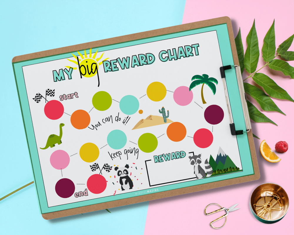
Source: mindfulmazing.com
One of the pitfalls of comparison charts is the temptation to include too much information. A cluttered chart can overwhelm students and defeat its purpose. Remember: less is often more. Stick to essential data and prioritize clarity over completeness. If additional details are needed, consider creating supplementary charts or providing handouts.
3. Choose the Right Format
The format of your chart should align with the type of data you’re presenting:
- Bar Charts: Great for comparing quantities or the frequency of occurrences.
- Pie Charts: Ideal for showing parts of a whole.
- Venn Diagrams: Perfect for comparing and contrasting features of two or three items.
- Tables: Useful for side-by-side comparisons of multiple items on several parameters.
4. Use Color Wisely
Color is not just an aesthetic choice; it’s a potent communication tool. When deployed strategically, it can guide students’ eyes and enhance the differentiation of data points. Consistency in your color palette promotes smooth visual flow, making it easier for the mind to process information.
For instance, when comparing two items, you might use two distinct shades. If you’re highlighting differences, consider using contrasting colors, while similarities might be denoted with harmonious shades.
5. Ensure Readability
Your chart should be easily readable from a distance. This means:
- Font: Choose a clear, legible font and ensure the text size is large enough to be read from the back of the classroom.
- Labels: Every section of your chart should be labeled. If using abbreviations, ensure they are common knowledge or provide a key.
- Spacing: Avoid cramming too much information close together. Give your data some breathing space.
6. Stay Objective and Unbiased
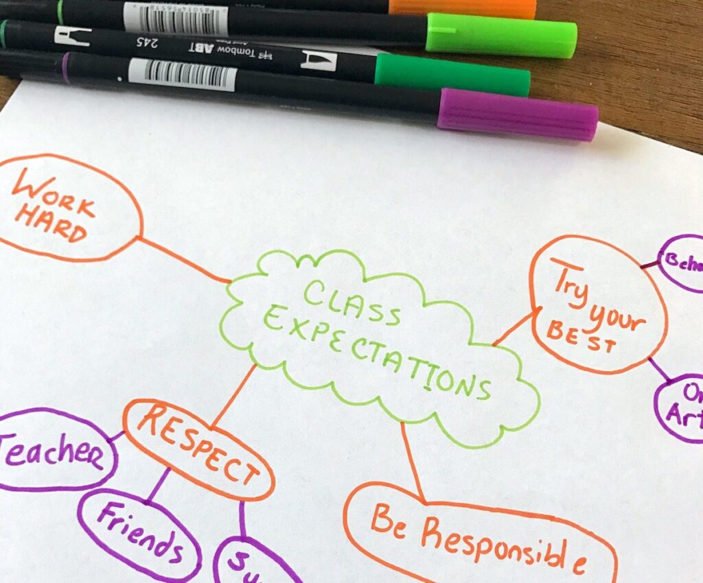
Source: theartofeducation.edu
It’s easy to inadvertently introduce bias, especially when dealing with subjective topics. Ensure that the information presented is balanced. If there are varying viewpoints or theories about a topic, present them all fairly. Let students draw their own conclusions based on the data.
7. Involve Students in the Creation Process
Involving students in the process of creating comparison charts can be an educational experience in itself. Allow them to gather data, decide on the most effective format, and design the chart. This not only enhances their understanding of the topic but also teaches them the importance of clarity and objectivity in data presentation.
8. Review and Revise
Once your chart is ready, review it for any errors or potential improvements. Show it to a colleague and gather feedback. Sometimes, a fresh pair of eyes can spot issues you might have missed.
Bottom Line
Comparison charts, when designed effectively, can be powerful tools in the classroom, making complex data understandable and learning more engaging. By following the steps outlined above, educators can ensure that their charts serve as valuable aids in the teaching process, fostering better comprehension and facilitating deeper discussions. Remember, the key lies in clarity, simplicity, and objectivity. Happy charting!

 and Why Is It Important?")
