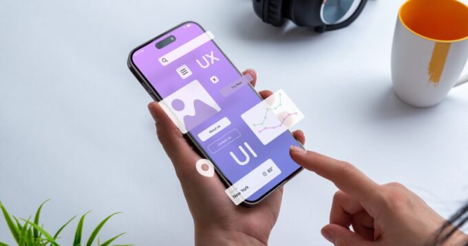
Smartphones flipped the script on digital products. A decade ago, computers ruled the web. Now? Your phone probably gets ten times more action than your laptop.
This enormous shift caught many developers unprepared.
From Desktop Dominance to Pocket Power

Source: martech.org
Remember when checking email meant sitting at a desk? Those days feel like prehistory now. Websites used to stretch across huge monitors.
Dropdown menus nested inside other dropdown menus. Designers filled every space with links, maximizing screen real estate.
Phones wrecked that whole setup. One day everyone is hunched over keyboards, the next day they are poking at glass rectangles during lunch breaks.
The switch was incredibly fast. Desktop sites looked like garbage on phones. You’d load a page and get microscopic text. Buttons turned into specks. People gave up trying to navigate these disasters.
Some companies got the memo early. Others kept building for 2005 while their users abandoned ship. By 2016, mobile browsing was far ahead of desktop. The gap is widening.
The Birth of Mobile-First Thinking
Clever people started backwards. Build for phones first, then scale up. Sounds obvious now, but back then? Revolutionary.
This wasn’t just about squeezing content into smaller boxes. Phone screens forced brutal choices. Keep this feature or that one? Can’t have both. No room. This constraint helped.
Products got cleaner. Faster. They stopped trying to do seventeen things poorly and started doing three things well.
Mouse clicks died. Finger taps took over. It felt strange to swipe at first, but it’s natural now.
Developers invented new gestures for interaction, such as pinching, holding, and pulling.
Forms shrank because pecking at virtual keyboards sucks. Every second of load time started mattering since phone connections bounce between lightning fast and dial-up slow depending on where you are standing.
Design Principles That Define Success

Source: rgd.ca
Today’s products follow new rules. Buttons sit where thumbs naturally rest. Text stays big enough for tired eyes on bumpy subway rides. Empty space isn’t wasted anymore; it’s breathing room for clumsy fingers.
Goji Labs and similar companies nail this stuff, building mobile experiences where the UX/UI melts into the background because everything just works.
Great mobile design vanishes. You finish tasks without noticing the interface existed. No hunting for hidden menus.
No accidentally tapping the wrong thing. Getting there requires obsessive testing with all kinds of people using different devices in different situations.
Bright sunshine kills weak color choices. Phone screens need serious contrast to remain readable outdoors.
Battery drain shapes decisions, too. Dark backgrounds save juice on certain displays. Battery drain limits the use of fancy animations. All decisions involve sacrifice.
The Platform Puzzle

Source: medium.com
Mobile development feels like juggling chainsaws. Android plays one way, iOS another. Some people rock brand-new flagships while others squeeze life out of five-year-old budget phones.
Software versions scatter across the map. While your sleek feature might excel on new hardware, it could falter on equipment that’s over two years old.
Progressive web apps showed up as a partial fix. They live in browsers but act like real apps. One version covers all bases.
Updates happen silently. They work without the internet once loaded. Notifications pop up just like native apps. The catch? They can’t tap into every phone trick that built-in apps access.
Conclusion
Phones rewrote the playbook for digital products. Desktops still exist, sure, but mobile became the main stage.
Winners started designing for small screens first. They removed unnecessary parts, increased speed, and optimized for touchscreens.
Companies that caught on early now dominate their markets. The ones still thinking desktop-first? They are losing users daily. Success means designing for the device in your pocket.


